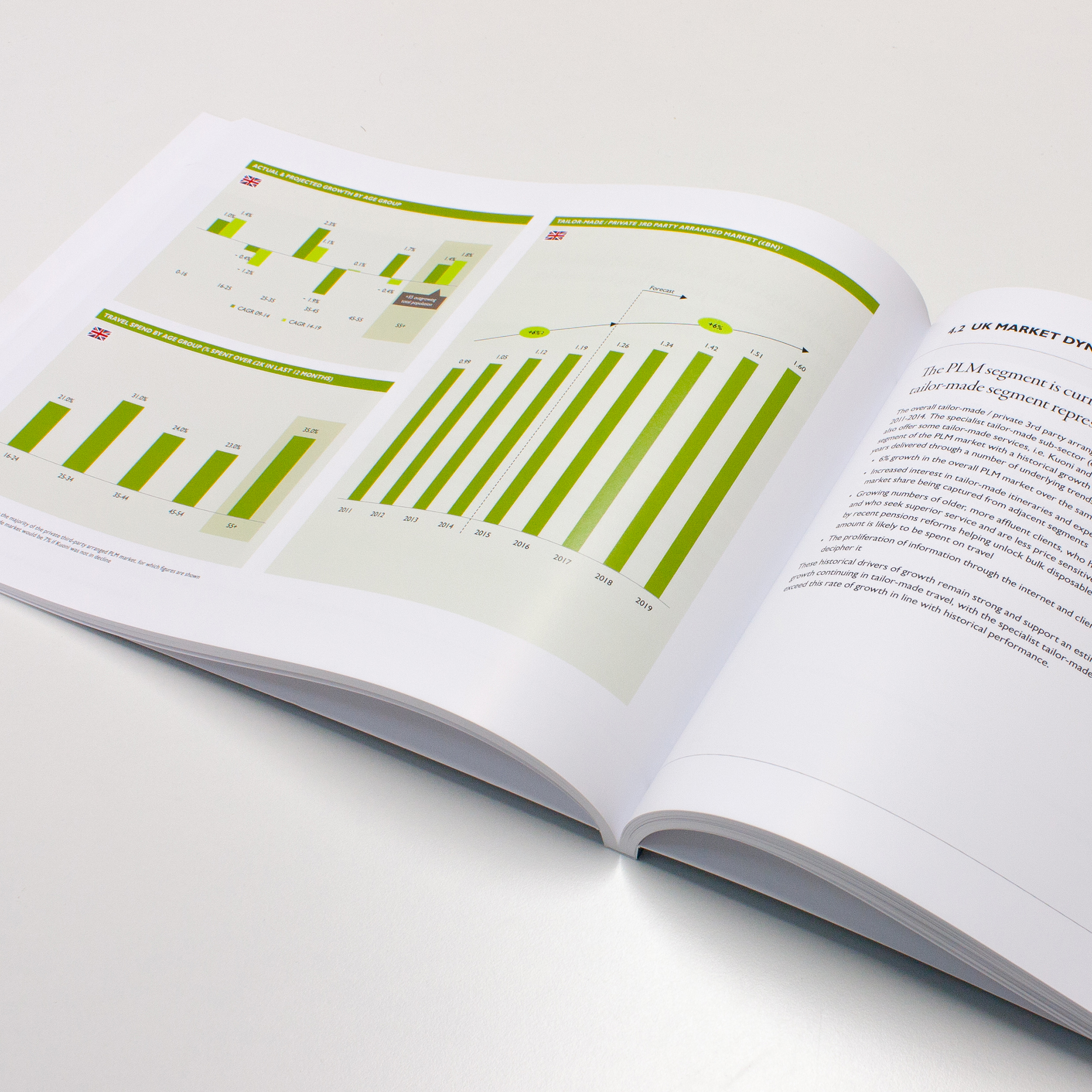
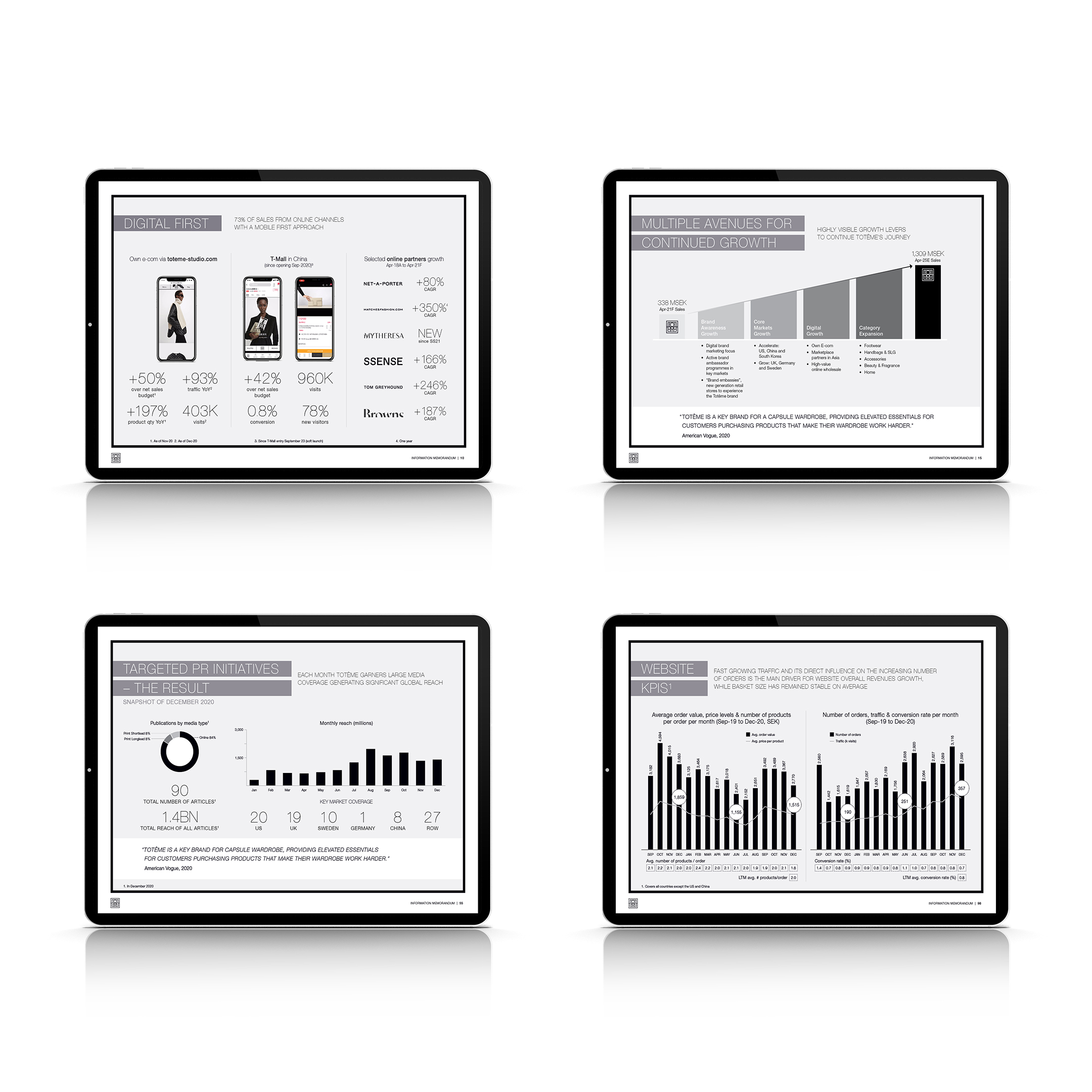
We are often briefed by being given a complex set of words and data and told to make it look good. That’s fine, it’s what we’re good at.
Our purpose is to create stimulating, impactful and effective communication. Agencies employ creatives; banks, venture capitalists and consultancies employ analysts and deep thinkers. We have a skillset that turns the ordinary into something far more visually-stimulating, taking a standard PowerPoint presentation and making it look far more impactful, legible and interesting.
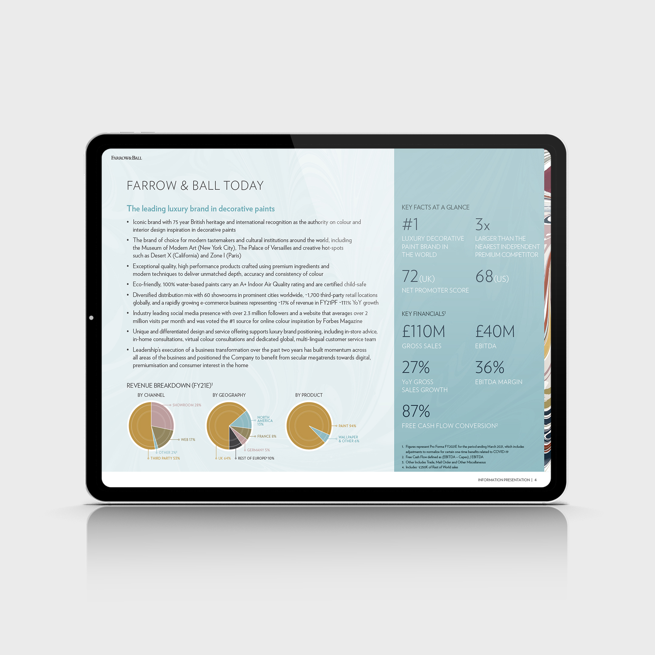
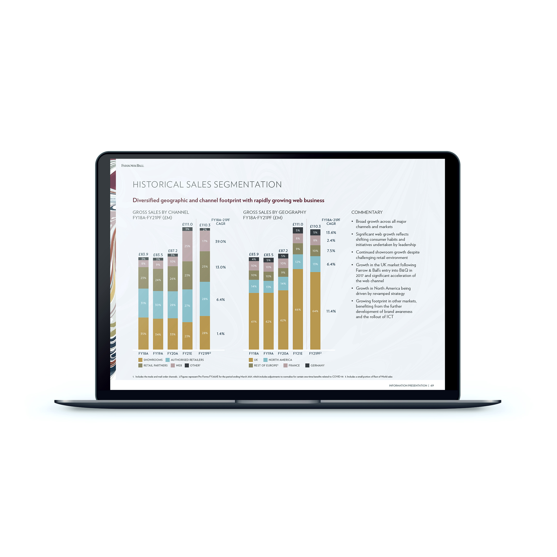
We always try to look at a sales deck, presentation or information memorandum from the perspective of the person who is going to receive it: they don’t know what’s in it and will not be aware of the hours spent developing the content.
So, we think about pace, giving an idea of what’s coming up, providing visual punctuation as well as literal pauses. Give the page enough room to breathe. White space is our friend, not an opportunity to cram more data in!
And then there’s colour. Why, if a company has a set brand guidelines, do so many presentations rely on blue, black and white?
As creatives our role is to stimulate, excite and expand our clients’ imaginations. We always start with a set of brand guidelines and use these to dictate how a presentation may look. It’s not about using every colour of the rainbow and a myriad of clever devices but about using key elements of a brand identity to help make points more impactful